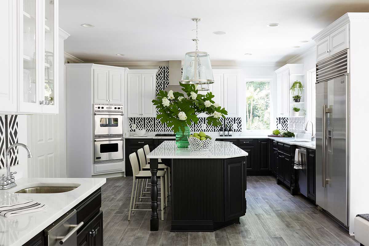
For instant drama, there’s no surer formula than a black-and-white color scheme. Sallie Lord, interior designer and owner of GreyHunt Interiors, a Chantilly-based design firm, explains how to use the most elemental form of color contrast in your space.
Consider the rules of contrast.
Lord is quick to explain that she shies away from the term “rules” in her work. “A guideline I go by—because I don’t believe in rules in design—[is that] I want to know how someone wants to feel in a space,” she says. “That determines a lot, especially when you’re dealing with color because it creates different emotions.”
If somebody wants to feel “light, bright, happy, and energized,” that tells Lord to use black in smaller doses. “If somebody tells me that they want to feel cozy, or [they want] a dramatic environment, or a little sexy, then I know that the darker is going to be the dominant color, and the darker tone will create warmth and the feel of a visual hug. There’s a safety and moodiness to the darkness.”
Soften the edges.
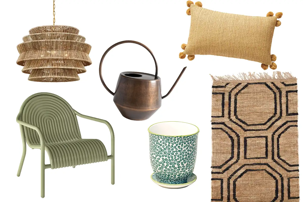
Lord incorporates softer hues and tones to reduce the sterility that can otherwise creep into black and white decor. “Gold is your warmth,” she says. “A lot of times, with cooler palettes like black and white, people still need to feel that warmth to not feel like they’re in a sterile environment.” Gold creates a juxtaposition against the cool tones, says Lord, and lends a well-rounded look.
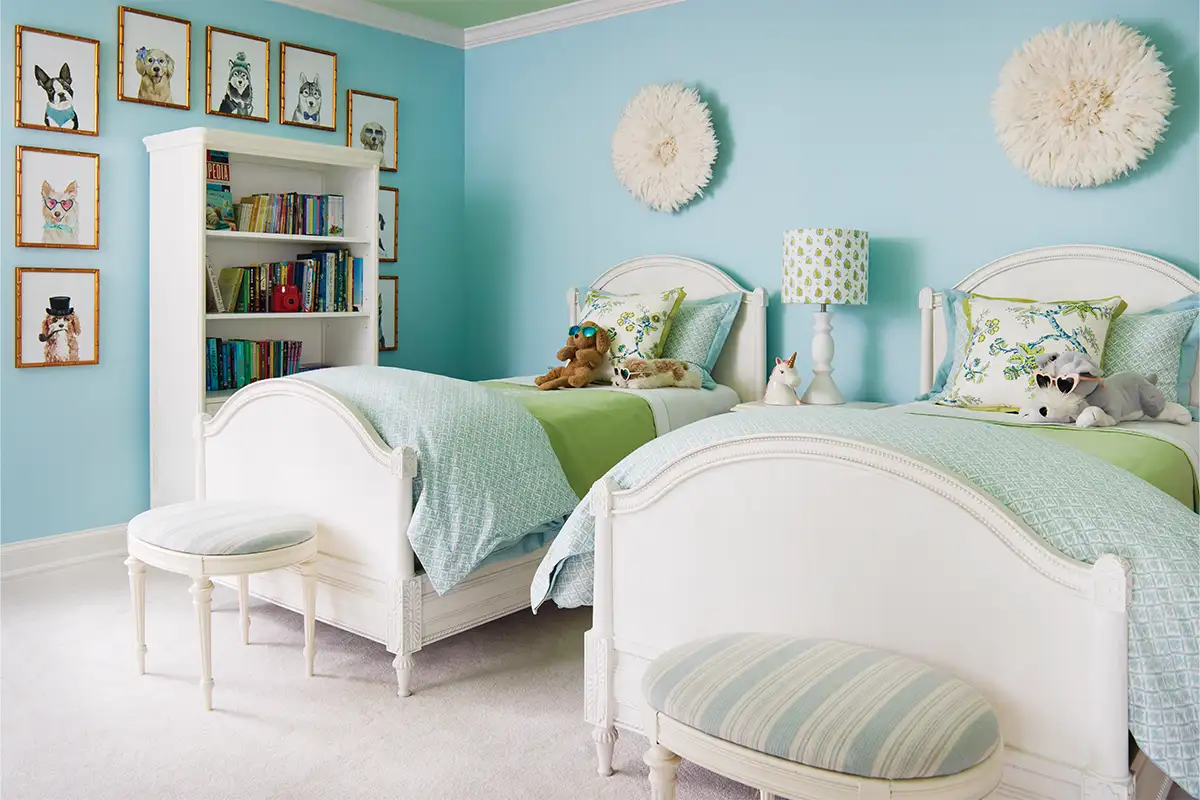
Lavender is another favorite choice when working with black and white. “It’s a very calming color, [and the bedroom is] a great place to apply the purple and lavender or eggplant tones,” she says. Combined with black and white, she says, it creates a calming palette.
Mix patterns (yes, you can).
Don’t be afraid to experiment with going a bit beyond your area of comfort when using patterns and contrast, says Lord. “With pattern play, working with different scales and textures is key,” she says. “You could take a pillow that’s velvet and have a linen pattern on top of it that’s a solid. When mixing geometrics, I might mix in an animal print with a stripe. Both are accomplishing two different appeals. One is more structured and one more organic … My recipe is to play with tone and texture.”
Bring in brights.
When it comes to bringing in accent colors, think about what inspires you. “Our Emerald Gem project is a black-and-white house with emerald green [accents],” says Lord. “A client I worked with for many years happened to have this emerald green Valentino clutch. That’s where the design took off, and I started applying those high-contrast colors to that space.”
In the same vein, Lord says to trust what moves you when using color in your space. “I feel that everybody has a spirit color—a certain color that does something for them—and in a high-contrast space, that color creates the canvas.”
This story originally appeared in our February issue. For more stories like this, subscribe to our monthly magazine.