Could the shades of gray paint we’ve seen in recent years be headed out? The 2025 colors of the year that paint companies selected place more emphasis on deep, saturated hues.
Behr’s 2025 Color of the Year is Rumors MQ1-15, a ruby red. Glidden named a bold Purple Basil its color, while C2 Paint went with C2 Raku, a brownish red with mahogany. Valspar selected a rich sapphire shade called Encore. Cinnamon Slate, a plum and brown, is Benjamin Moore’s choice.
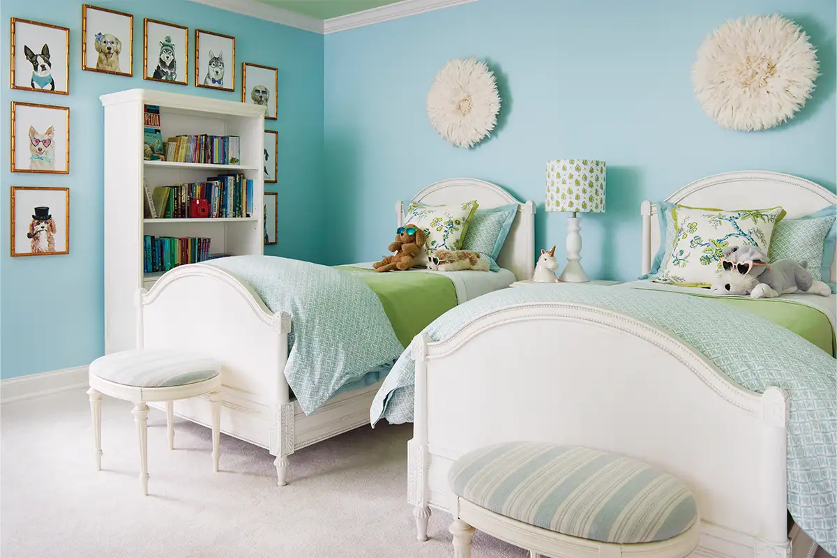
Meanwhile, The Sherwin-Williams Color Collection of the Year features Quietude, a soft sage with just a hint of blue. The company’s Chrysalis palette for 2025 emphasizes warmer neutrals over cooler neutrals. Ochres and browns are starting to appear as well. Little Greene selected Mochi, a warm brown, as its color for the coming year.
Area designers who work with Northern Virginia clients say trending colors don’t tend to have an impact right away.

“We use color a lot for setting the mood or the tone of the space,” says Susan Sutter of Arlington-based Susan Sutter Interiors. “I would recommend those darker, really saturated tones, like the dark blues and the dark ochres, to be in spaces where you probably are looking to retreat or relax, not a space where you’re doing a lot of food preparation or task work.”
Saturated colors work in TV rooms, powder rooms, bar spaces, and libraries, Sutter says.
Designer Kelley Proxmire, who loves figuring out how rooms flow together, says a concentrated color envelopes a room, making it feel dramatic. “I’m seeing a lot more being willing to do whole rooms in one color, which is, again, not that new, but it’s more popular now, I’d say. I think people are going a little bit darker,” says Proxmire of color choices.
For one of her clients, she used medium and darker greens, including Farrow & Ball Calke Green No. 34, for a library and family room. “We did the wonderfully crafted bookcases and the walls all in the same color. And that’s quite striking, and it still has windows on three sides, so there’s still a lot of light in the room during the day,” Proxmire says.
In addition to rooms of all one color, with painted bookcases, Proxmire says, “Accent walls are a little more popular now than they used to be.”
Sutter uses accents as pops of color, as she did with a red coral paint on a client’s TV wall. A shade that matched Tangerine Dream appeared in the room’s accents and wallpaper for a powder room, along with blue. In another project, a bathtub was custom-painted a dark blue. “It really gave the clients the look they were going for, which was Southern, preppy, and luxurious,” she says.
Designers say people typically don’t suggest specific colors. Instead, they ask clients lots of questions about how they want the room to feel and how it will be used.
“Are you looking for a light and bright, airy sort of space? Are you looking for a cozy, intimate space? Are you looking for a bright, energizing, fun kind of room? That’s really the starting point of figuring out what the personality of that room is going to be,” says Jessica Parker Wachtel, a senior associate at GTM Architects.
“If somebody feels like they want to be really bold and go for it and do all one color, I’m all for that,” she says. “I try to just help embrace whatever it is my client is looking to do with their space.”
In one project Wachtel worked on, the homeowner used different shades of green paint. “Each downstairs room has a touch of green to make the rooms flow together, whether on the walls, in the fabric, on the Swedish furniture, or in a painting,” the homeowner said.
“Green in general is a great neutral,” Wachtel says. “There are so many different directions you can go with it. It can be really saturated and rich, or it can be more of a neutral, sagey kind of green that’s going to bring the outdoors in.”

While trendy colors may not be NoVA choices initially, both Proxmire and Wachtel say clients are shifting away from gray. “People seem to be leaning towards warmer neutrals, even when we’re looking at white. I feel like people are tending a little bit more towards the slightly warmer, a little bit more of a rich neutral, rather than just sort of cool whites and cooler gray colors,” Wachtel says.
No matter what paint color, designers say testing it out is paramount before painting an entire room.
Sutter says she made a mistake when she painted her guest bathroom a light blue-gray she loved. “We put it on in this windowless bathroom, and it looked like mud on the walls. And that was definitely one of those, ‘Wow, this same color looks great in [a different] space, but it does not look good in here,’” she says.

Proxmire says you also need to pay attention to the paint’s finish since companies have different finishes and textures. In an older home, a gloss may reveal imperfections, unless you do a lot of wall prep, she says.
The advice of all three designers: Put paint samples on every wall. Look at them at different times of the day to see how they respond to changing daylight. Make sure you look at them with the lighting you’ll have in the room.
“Natural light is very important, and it’s really important that people sample colors or tape up the samples in the actual room that it’s going to go in,” says Wachtel. “So many people just go to the paint store and see a paint they like and bring it home, and it’s going to look so different in your space because everybody has different light coming in.”
Designers say you must account for how colors fit with the rest of your home so it’s cohesive.
Feature image by Kip Dawkins
This story originally ran in our December issue. For more stories like this, subscribe to Northern Virginia Magazine.