What better way to brighten up a room than with a splash of vibrant color? In this Home Tour, take a peek into three different spaces as designers share ideas on how to incorporate bright hues into your home.
Hygge Hues
Coziness is the feel Nicole Lanteri wanted to create for a couple with two young children who live in a row house.
“Our overall design was driven by the desire to create a sense of hygge in this home, creating cozy nooks for the family to gather in this first-floor living space,” says Lanteri of Washington, DC–based Nicole Lanteri Interiors. “We love color for the energy, warmth, and personalization it provides to a space.”
When the homeowners purchased the house in 2022, it was a run-of-the-mill renovated row house doused in gray. High on the homeowners’ wish list, in addition to adding vibrance and personality, was to have Lanteri install a long bench seat in the front window and create a functional drop-off entry area for the family because the home does not have a foyer.
“My husband is Swedish and has fallen in love with the Stockholm-based design shop Svenskt Tenn. My only request to Nicole was to find something from it for the living area. I thought I’d end up with a lampshade,” the homeowner says.
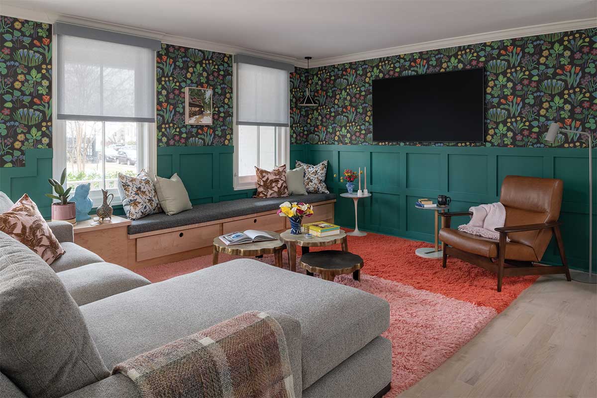
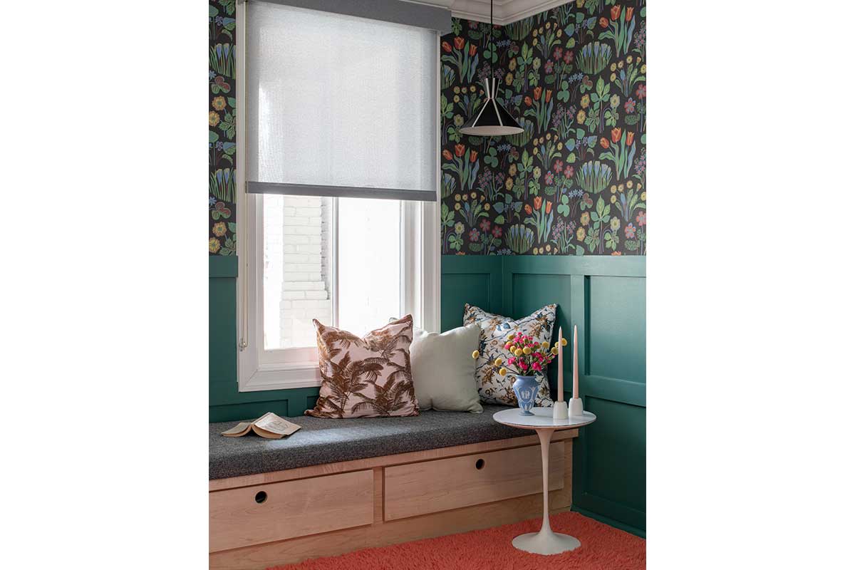
Lanteri kicked the request up a notch and found a whimsical Svenskt Tenn wallpaper with a spring-inspired floral pattern where blues, corals, pinks, and yellows pop from a dark neutral background. She paired it with custom grid-patterned wainscoting in teal and a 14-foot built-in bench with storage below. The dining room adjacent to the neutral kitchen is saturated in blue.
“In general, we knew our clients love blues and greens, so we went with that as a starting point. But we always strive to add balance between the warm and cool tones, hence our coral and blush rug, and, of course, the multicolored wallpaper,” says Lanteri.
A sectional in the main sitting area serves to create the sense of an entry hall. Behind it, there’s a bench, peg board, and colorful rug where the family can take off their shoes and jackets as they come in the front door.
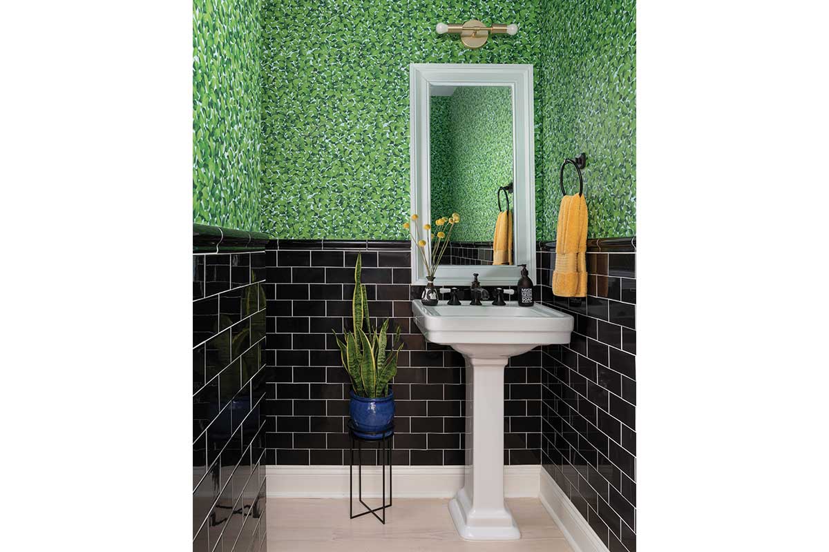
One of the best spaces in the home, where many homeowners are willing to take a risk, is the powder room.
“We created a jewel of a space with simple subway tile, with white grout, and a fun greenery-inspired wallpaper. It’s a space that now sings,” says Lanteri.
Orange Crush
“We were lucky our client had an amazing sense of style and a love of bold color,” says Waterlily Interiors designer Tracy Schlegel about a design refresh project she undertook with her business partner and sister, Kelcey Huff.
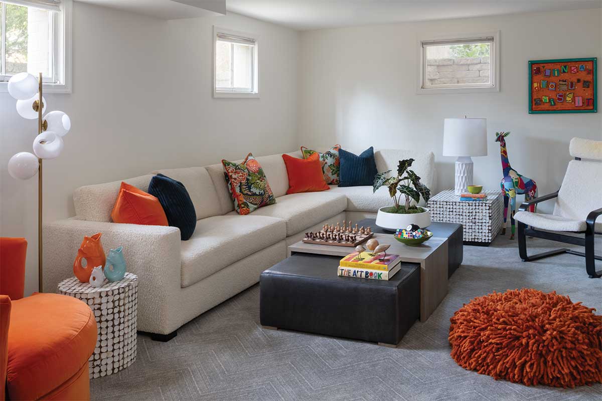
Julia Docking and her husband, Tim, have lived in their home for 18 years, raising three kids. With the last off to college, the empty nesters wanted their main level remodeled one room at a time.
“We wanted our home to be beautiful, modern, and uncluttered, with unique, fun spaces for all kinds of occasions,” says Julia. “Orange makes me happy, so that was on my wish list.”
Schlegel says her client is “all about orange. Orange in every shade: satsuma, paprika, saffron, mango, and persimmon.”
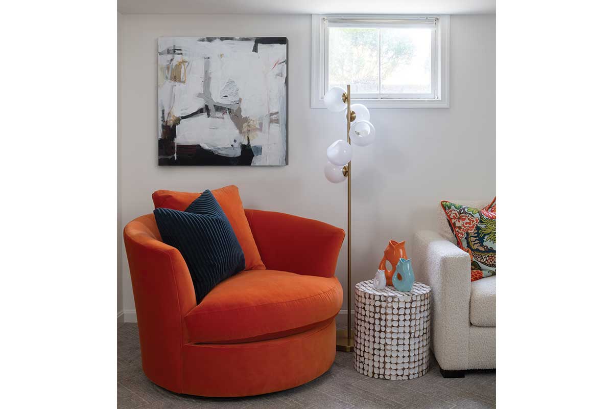
In the living room, which was rarely used because it lacked adequate seating, the designers painted the walls with Benjamin Moore’s Narragansett Green HC-157, which reads like a blackened teal. They added a roomy tufted, cream-colored Chesterfield sectional. In addition to the L-shaped seating with chrome nailhead trim, two rounded swivel armchairs and a pair of ottomans in patterned textiles bring cool blues and warmer tones into the color mix. But it’s the orange throw pillows that make the space shine.
“In this room, we dialed back the overall color to make the orange pop. The multicolored patterns and contrasting deep hues also balance the intensity of the orange,” says Huff.
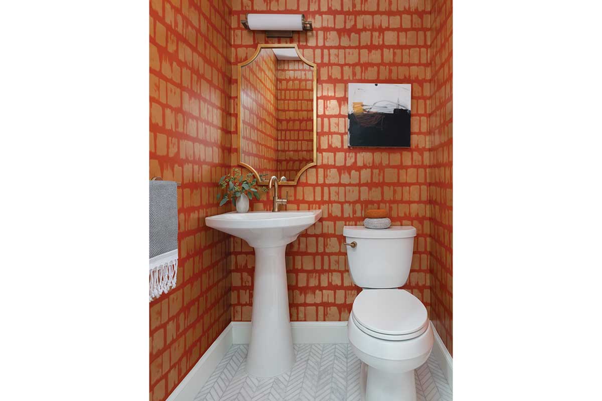
In the powder room, the sisters went all out with metallic wallpaper in persimmon orange. In the dining room, which features moss green upholstered armless chairs and a neutral forest-patterned wallpaper, a coral-pink orange shows up sparingly in the graphic of the curtain panels.
“There is a painting in my dining room by an artist from my hometown in Canada that also inspires me,” says Julia. “It’s full of color and surprises. Every time I look at it, I notice something new.”
What is always there are the hues used throughout the home’s palette: teal, blue, green, orange, and purple. Grays and creams are the neutrals.
“We think color adds the character that makes a house a home,” says Schlegel. To which Huff adds, “Don’t be afraid of it. If it makes you happy, you’ll love it in your home.”
Autumnal Vibe
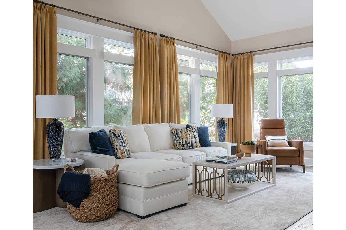
Sometimes it’s hard to shift out of neutral, but Leesburg-based interior designers Michelle and Catherine Troxell, a mother-daughter team at Grace Thomas Designs, found a way to make color work in this once-neutral Arlington home.
The 1920s Sears bungalow, which had an addition built in 2018, is home to a professional couple and their Goldendoodle. The remodeled space features a living room, kitchen and eat-in nook, and a great room accessed through a custom live-edge barn door. The great room is divided into seating and dining areas and works beautifully for entertaining guests.
“During our design consult with Michelle and Catherine, ‘green velvet’ popped out of my mouth, from where, for what — [I have] no idea, but the team ran with that and built our room schemes around it,” the client says.
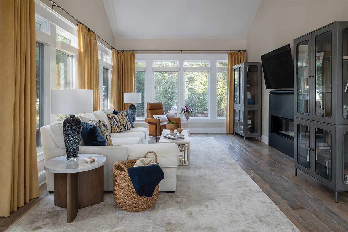
Starting with the front living room, the vision evolved from an emerald green to a forest green. That turned the color story from jewel to autumn throughout the main floor, which features a range of soft greige neutrals and buttery caramel hues. Pops of additional color include slate blues and deep ochres. The palette works beautifully with the home’s vintage vibe.
“The majority of the main floor is open plan with reclaimed hardwood flooring. We wanted a cohesive design that felt comfortable, soft, and welcoming throughout the rooms,” the homeowner says.
In the living room, a pair of textured dark green porcelain lamps sits on either side of the sofa; the hue is also picked up in the contrasting thread on the sofa’s embroidered cream throw pillows.
“We balanced out the green sofa with a pair of neutral leather chairs,” says Catherine. “Though the color defines the feel of the room, we wanted it to be sparing elsewhere, for balance.”
In the adjacent great room, dining room chairs upholstered in a slate blue textile define that space, and the wall art diptych incorporates all the colors, including the rich ochre that picks up steam in the sitting space.
“Again, the neutral ground or base, the sectional, and carpet in this case, allowed us to go with a bolder color in the drapery, making a statement,” says Catherine. “The throw pillows gave us another opportunity to build on our color story and bring in the blues to this part of the room.”
Feature image by Robert Radifera for Stylish Productions)
This story originally ran in our July issue. For more stories like this, subscribe to Northern Virginia Magazine’s Home newsletter.