By Jennifer Shapira
From shoebox powder rooms to spacious masters, area designers say achieving a look of high-function that meets high-style is in the details, not necessarily in dollars.
In: The popularity of gray tones, which works well with any palette. Warmer grays have a more transitional vibe, says designer Jenna Randolph. Cooler tones feel more contemporary. Either way, it will complement everything else in the home, she says.
Out: While neutrals are still in, beige was big a decade ago, and has since trended out, says designer Kerry Ann Rodriguez.
In: The creative use of tile to create texture, or using longer, wider tiles that conveniently require less grout, creating a linear effect. Even the most basic subway tile can get a clever new spin, in staggers, herringbones or pops of color, says Randolph.
Out: Flat, uninteresting tile; an outdated mosaic pattern.
In: An absolute must in today’s modern showers: cut-out niches for stashing go-to body scrubs and shampoos.
Out: Shower essentials stored in non-personalized, hard-to-reach spaces.
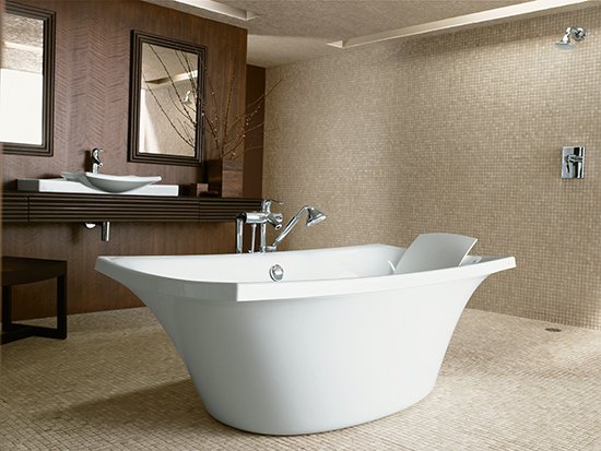
In: Spa-worthy, free-standing soaking tubs made from volcanic limestone that retain heat naturally, and the wow factor that these museum-quality works of art possess.
Out: Generic, non-personalized bathing spaces.
In: Sculptural floating wall-mounted vanities that use storage space efficiently.
Out: Vanities that possess useless, lost storage space, a result of dated plumbing.
In: Floor-to-ceiling accent walls that are tiled in textures that beg to be touched or painted in eye-catching pops of color.
Out: Stark, monochromatic color schemes devoid of any visual interest.
In: Edit a bathroom’s “personal effects,” says designer Sallie Kjos. For example, she suggests stowing boxes of tissues out-of-sight, under the sink or inside a cabinet.
Out: Cluttering a countertop with bath items for the entire family.
(September 2014)