Getting Warm
I’ve really enjoyed working on this house,” says interior designer Bonnie Ammon, when discussing an ongoing home redesign driven by color for a family in McLean. “I love that they want to have color in their home, not have it be all neutral and monotone. Our plan was to create ‘happy,’ colorful rooms using bright, often warmer tones.”
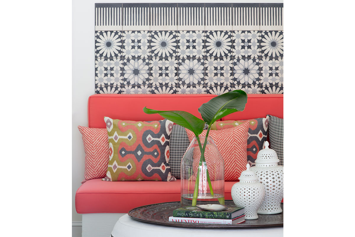
One of the first spaces Ammon worked on was the sunroom, which she conceived of as a casual, yet vibrant living space, combining a year-round Southern California vibe with an exotic wanderlust, Moroccan feel.
This article originally appeared in our November 2019 issue. For more Home & Design content, subscribe to our weekly newsletter.
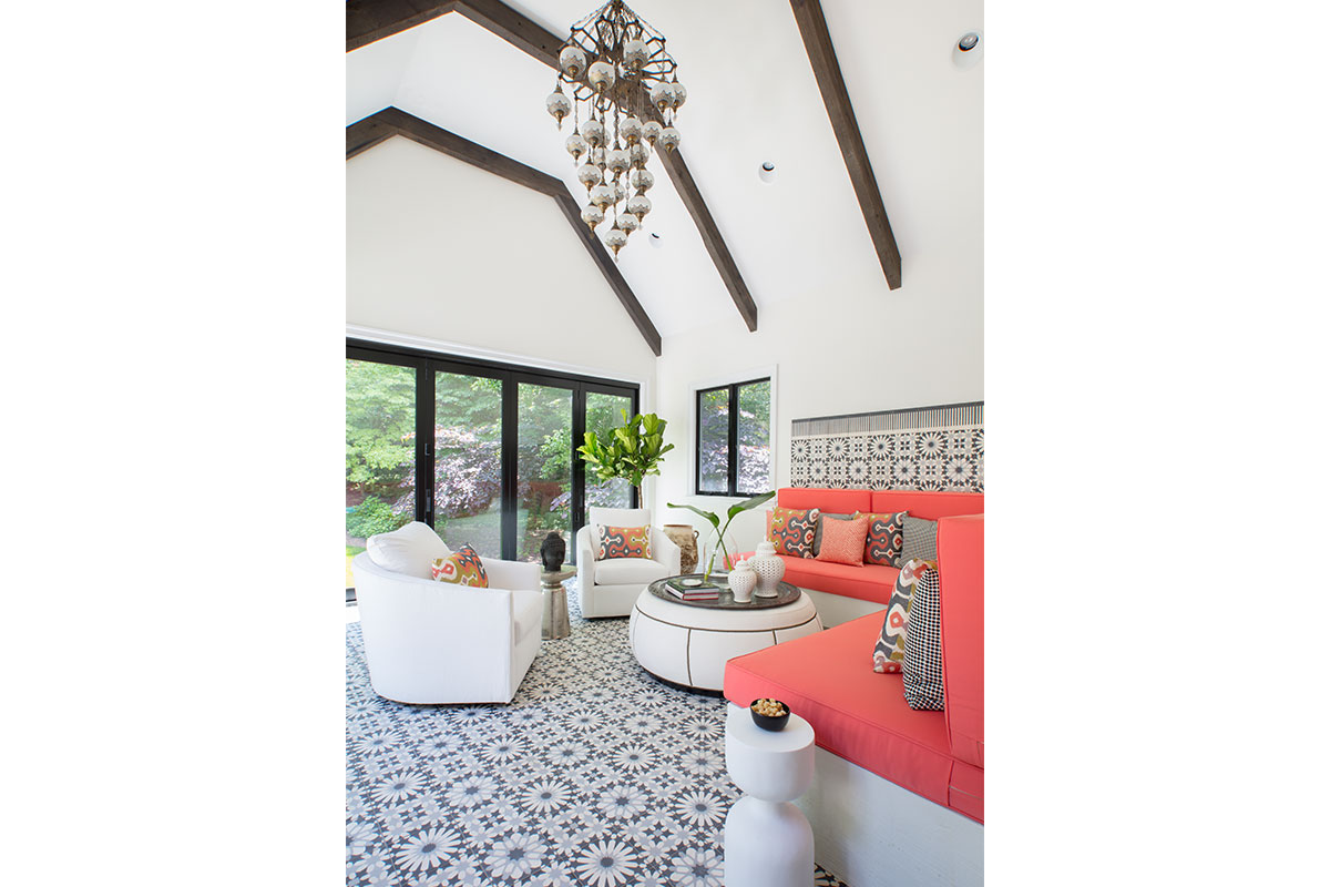
“The homeowners travel widely and they had sourced the light fixture in Turkey,” she says, adding, “That and the Moroccan-style tilework instantly make you feel like you’re in another country.”
But it’s the coral back-and-seat cushions on the built-in banquette that truly define the space. A variety of throw pillows also contain that bold hue for color continuity, while the neutral black, white and gray tones of the tilework, wall paint and furniture provide a calm canvas.
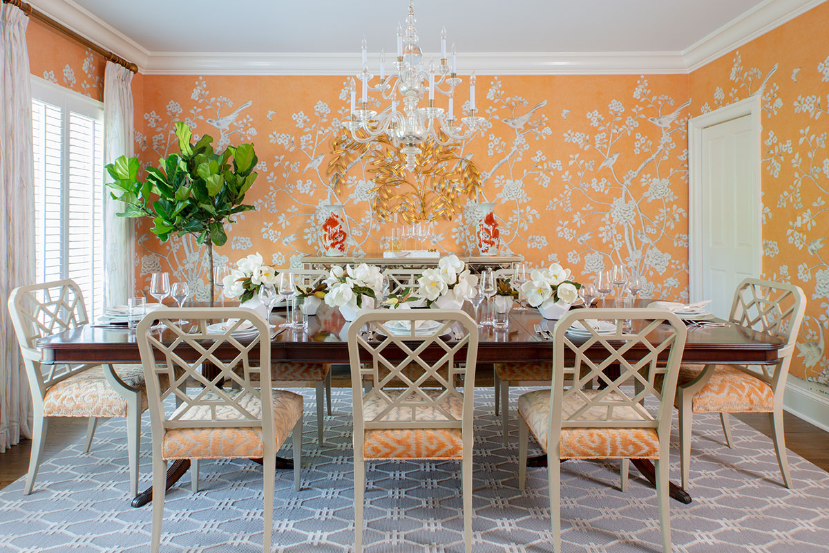
By contrast, the lively dining room is ensconced in a graphic wallpaper in vivid tangerine. The juicy shade is also picked up in the cut-velvet seat upholstery of the Chinoiserie-style dining chairs.
“I kept the chair finishes in a cream color to bring some softness to the room and balance to the darker wood of the homeowners’ antique dining table. It’s all about layering color,” adds Ammon.
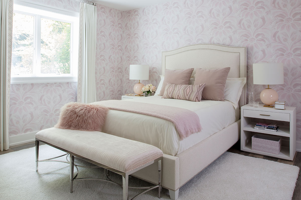
The guest bedroom showcases this layering well, with an inspirational wall covering in an updated damask floral design revealing various shades of blush. The colors are picked up in accent furnishings.
“The homeowner wanted the little girl’s room that she never had,” says Ammon, continuing, “By layering in different blush tones, we created a serene, almost neutral room, with a sense of adult sophistication.”
Patriotic Palette
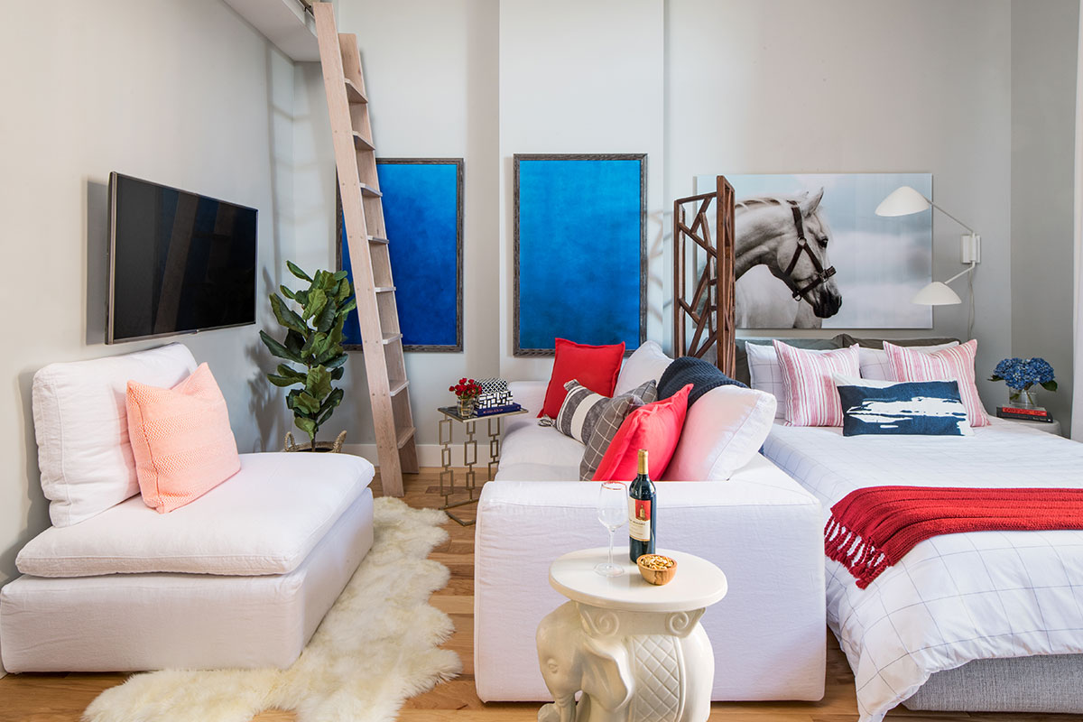
Color can be tricky to integrate into a 410-square-foot studio apartment—too much overwhelms, too little feels bland—unless you’re passionate about using it and have the skill to get the balance right.
Interior designer Carrie Miller of Lapis Ray Interiors made color work wonders in this Crystal City condo, with its neutral base enriched by blue and supplemented by red.
“To me, color is character!” says Miller. “It dictates ambiance. Soft colors can create a serene environment, while vibrant hues can invoke energy.”
Every color story has a beginning. In this case, the homeowner, a professional woman, owned several pieces of art—a trio of cobalt-blue abstracts, and a large-scale photograph of a white horse head.
“The art influenced our palette: We wanted to keep the overall space simple and light, with gray walls and white furnishings, like a Zen retreat,” says Miller, pausing before adding, “By creating the soft neutral base, we allowed the vibrant art to become the star of the show.”
Thus, while the wood floors went from the builder-grade, orange-tinged maple to a custom gray-stained hickory, the cobalt blue of the paintings provided an opportunity for continuing the color elsewhere in the home.
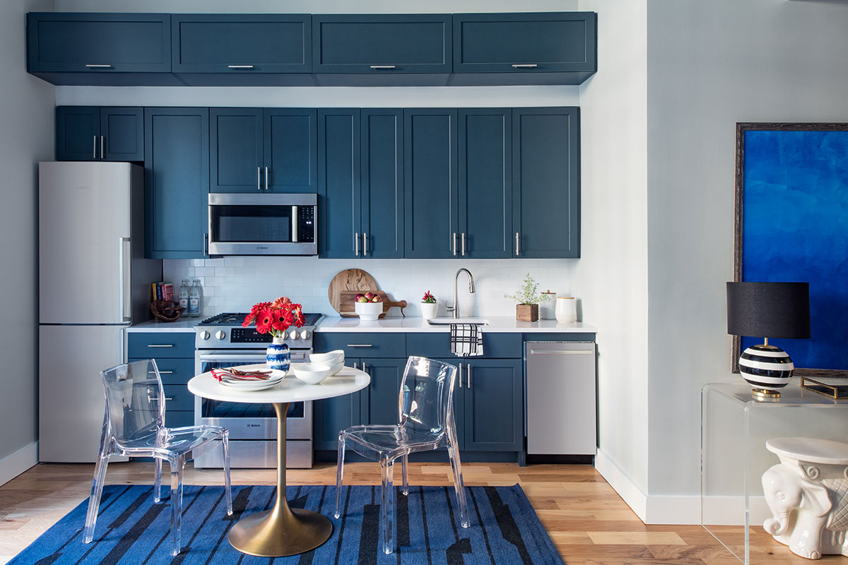
“Being a studio apartment, the kitchen would always be visible, so we wanted to make a bold statement. We went with a strong blue for the cabinetry, while balancing that with a white countertop and subway-tile backsplash,” says Miller.
The kitchen tempers the presence of the cobalt-blue artwork, which is dispersed painterly in different nooks, rather than hung as a solid block. Touches of red are also introduced, building on the lively red, white and blue palette, mostly in accent pillows and throws.
“Along with the layers of deep blue, the select red accessories add character to each area and cohesion to the condo as a whole,” she says.
Colorful Coupling
When working on a five-bedroom, 5,200-square-foot Mclean family house, interior designer Melanie Whittington and her team at Whittington Design Studio got to flex their color chops.
“This is the home of an active young family, with dual working parents, two small children and a dog,” says Whittington. “They wanted a clean, stylish and functional space, with a base of timeless neutrals, as well as bright accent colors to lend the home vibrancy and personality.”
For the overall palette, the homeowners gravitated toward nature-inspired greens (chartreuse, lime and Kelly) and blues (denim, turquoise and navy) for accent furnishings, and shades of gray and beige for quiet, calming colors.
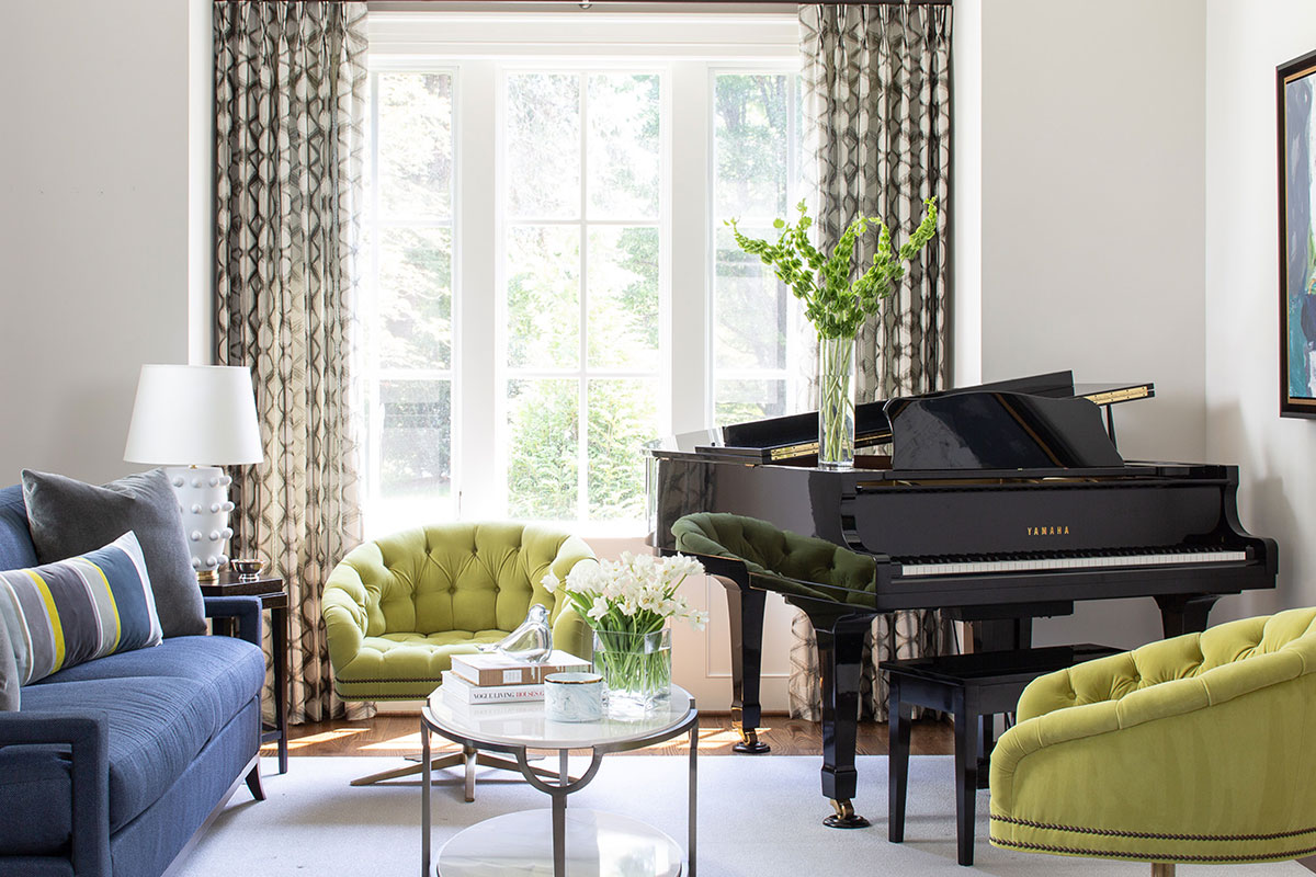
“We took our cue, as in all our projects, from the clients’ color preferences, and then selected pieces that matched the energy and positivity of this fun family,” adds Whittington of the palette.
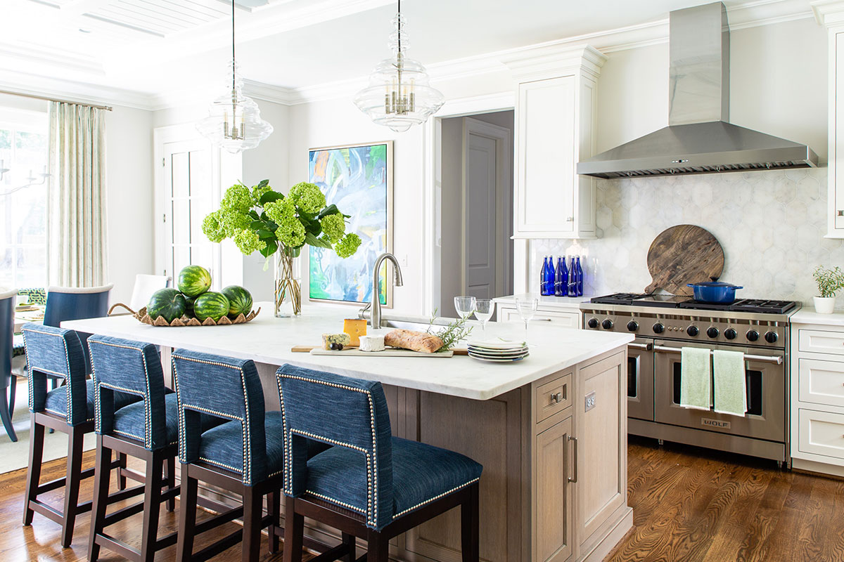
Each room has its own distinct color personality. For example, the front parlor pops with chartreuse, while the kitchen is awash in denim-blues.
“In each room, we started with a neutral base in the varying tones of gray and beige, and added accent furnishings in the green and blue families,” she says, noting, “The colors all work well together, but playing them differently in each room helps to define each space while making the flow from room to room harmonious.”
Meanwhile, transitional-style patterns in drapery, pillows or upholstery introduce another layer of sophistication and way in which colors can be blended. The kitchen’s banquette, for example, has a navy background, with a Kelly-green trellis. Art also brings the colors together in each space.
“Art is the focal point in these rooms. This was extremely personal and important to the clients. We worked with them throughout the design process to source art from various galleries and vendors,” says Whittington.