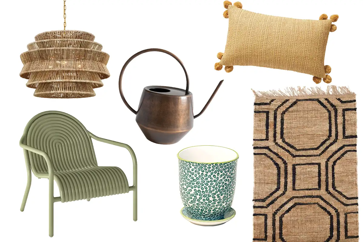
Despite the rest of the world’s struggles over the last few years, the luxury market has seen incredible growth. So, it makes sense that jewel tones are trending in interior color and finishes.
If you happen to live in tighter quarters than your average luxury consumer (or if your home has smaller rooms), the question becomes: How do you incorporate these soothing hues without making the space feel like it’s vibrating around you?
Three interior design talents share their expertise on bringing emeralds, sapphires, and rubies into your world in a figurative way. Here’s what they know.
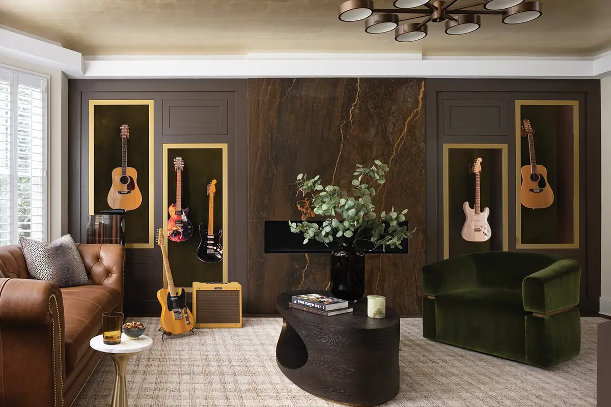
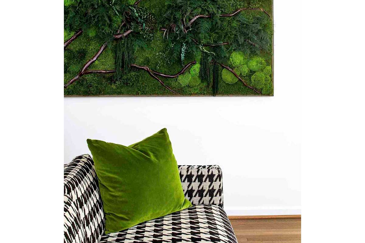
Ann Gottlieb is one of Home & Design’s Hot Talents — and it’s no wonder why. She’s an expert in color, offering a color theory watch-and-learn on her Instagram feed, and makes particularly beautiful use of jewel tones in her projects, by honing in on who her client is to create a space they love to live in.
When using jewel tones, she says the key is knowing yourself, as opposed to requesting what you saw in a magazine. “Honestly a lot of my design decisions are based upon the client’s personality,” says Gottlieb. “I don’t necessarily have a rule — it’s about what’s going to get them the most excited. … I have a client, and she was more southern, from Georgia. She’s got more of a classic style mixed with a glam taste … I used wallpaper that was very timeless, in a classic print. But, like her, it’s also bold. And it completely suited her personality.”
Wallpaper, which many people botch completely, is the area in which Gottlieb excels. The key, she tells us, is lighting. “In a smaller space, I make sure that the recessed lighting is of a good quality fixture so that when the lights are on, it doesn’t really matter whether the colors are very dark or very bright. … I get into the nitty gritty and I check out the foot candles and the light output, and the color temperature on all the recessed lighting that I ever select. I also make sure that, if it’s a light fixture that’s recessed, do I want the fixture to disappear into the ceiling? Or do I want it to have the same color trim as the color I’m painting the ceiling — or do I want the light itself to be adjustable?
In design, you have to know the rules in order to break them, but she does offer one when it comes to lighting. “I always put everything on a dimmer.”
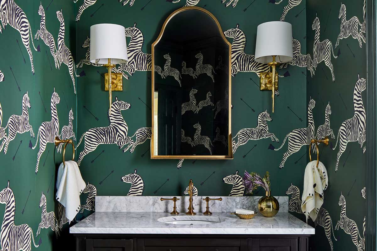
Rose Ramseur of Primrose Interior Design brings in the color concept through her use of tile and cabinetry, as well as fixtures to give rooms with a lot of neutrals a dose of energy.
“Sometimes, in spaces like bathrooms or kitchens, I’ll pick [cabinetry] in the jewel tone family because it’s a real punch in rooms where there’s a lot of neutral colors, or in kitchens with a bunch of stainless steel … or quartz tops that are all very white, or light-colored marble,” she says. “And so, you have this blank slate to add a bit of drama, and rich, deep color then becomes the focus of the room.”
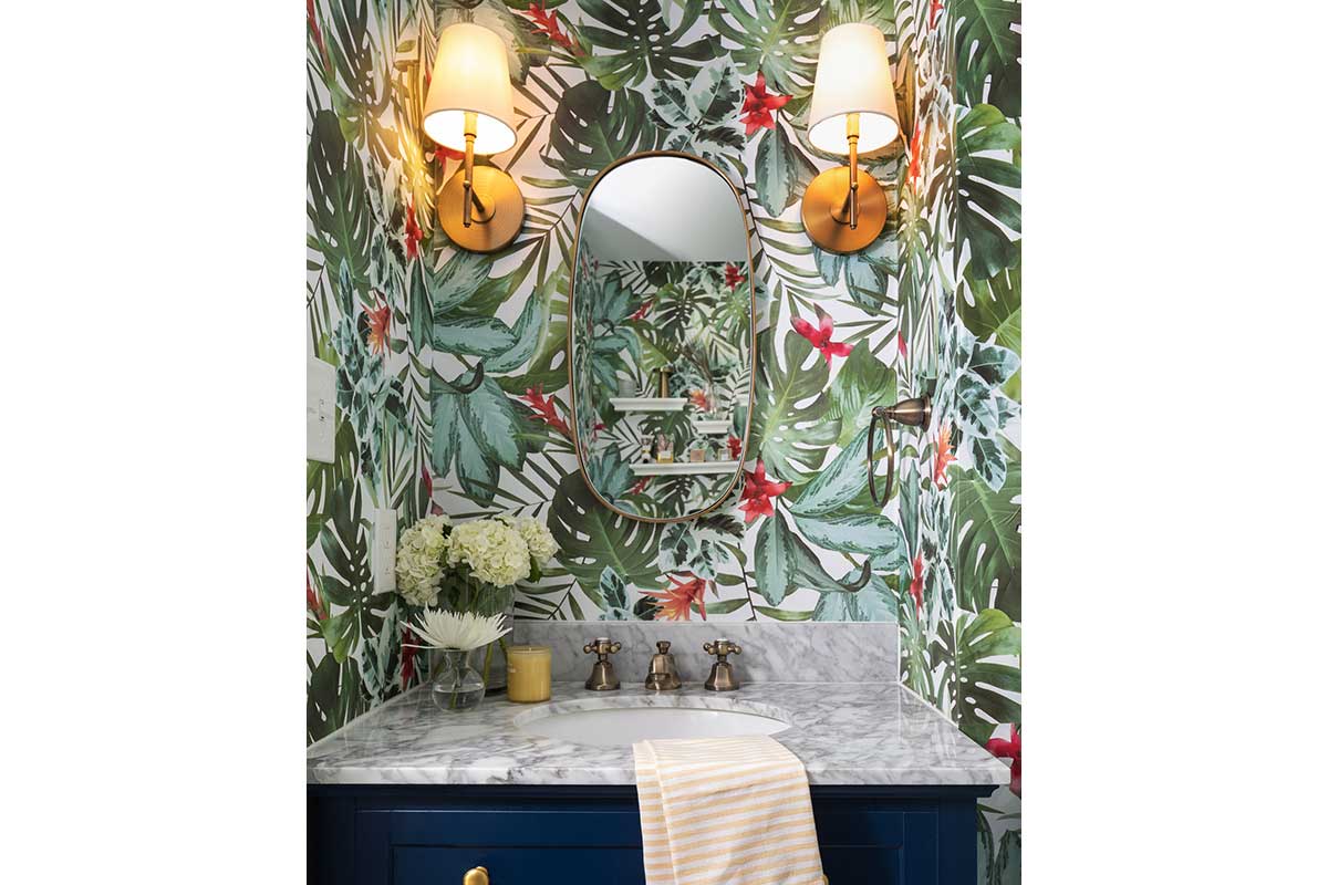
And in a small space, ratios are important. “It really is about balance,” Ramseur explains. “For example, I used a very saturated vanity color in a very small powder room, but the floor was a marble hex tile. The toilet was white. The vanity top was white, the ceiling was white. It’s really just about balancing that light and dark ratio, so you can have a very intense color if the other finishes are on the lighter side, or even if the metals are shiny and bright, then it balances.”
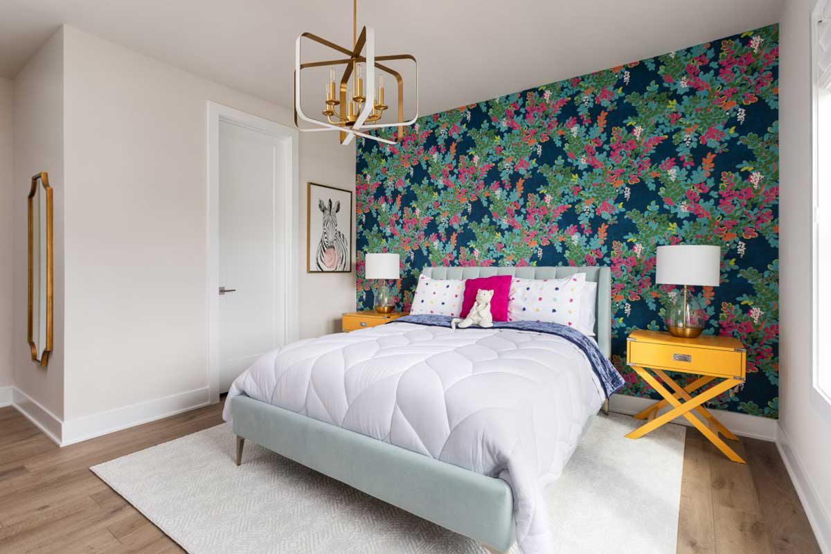
Michelle Troxell, the principal designer at Grace Thomas Interiors, explains how to select paint in a tone like a teal or a plum. Paint, which is about as tricky as wallpaper, is especially complicated when paired with wood trim.
“Jewel tones are typically on the warmer side, so when choosing a wood finish, you want to choose one that provides contrast from the paint color, but doesn’t conflict with the color tone,” says Troxell. “For example, Driftwood is a wood that has strong cool gray undertones…[it’s] not complimentary to a warm rich paint color. With a jewel tone color like teal or plum, you are better off going with a warmer wood that provides a neutral contrast. You do not want to go too warm, though, and pick a wood like cherry. Cherry has a strong red/orange color and that is how a lot of spaces end up looking dated. Recently we have been using white oak in our projects and have been really happy with it.”
As for paint, there are tons on the market, so how do you start to choose something that’s going to last, while still being on trend? “We always stick with Sherwin Williams or Benjamin Moore. We have found that they have the best quality for our projects,” says Troxell. “If it is a bathroom, we always use the Aura bath and spa matte finish. In other spaces we at a minimum use a matte finish, but often upgrade to an eggshell finish. We like to use eggshell finish in high-traffic areas such as the kitchen or family rooms, because it can be easily cleaned. This finish is great for families with kids and pets. For trim 99 percent of the time, we use a semi-gloss finish. The only time we use high gloss is if the client requests it.”
Feature image courtesy Ann Gotlieb Design
For more design inspo, subscribe to our Home newsletter.