By Jennifer Shapira
McCormick Paints
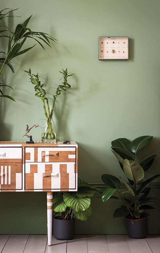
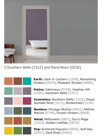
The 18 colors selected by Color Guild are grouped in six categories that characterize 2015. Liz Stone, color expert at McCormick Paints, says that based on how the market has been trending, the colors are right on target. The oranges and burnt oranges that epitomize Earth “are very popular right now,” she says. With Patina, says Stone, “we’ve been seeing the violets and purples often paired with grays,” like Heather Hill (1302) reflected in linens and in the walls of new model homes. The statement-making Cosmetics, she says, “are cheerful and fun colors.”
For the color-timid, Stone likes to suggest painting an accent wall because it makes an impact without being overwhelming. For example, the deep pink Bridesmaid (1159) is a bold hue, but if you like it, try it on a smaller scale: Give an old wooden chair a fresh update, or paint the inside of bookshelves for a surprise. For other options, Stone suggests using a splashy shade inside on floor boards or for the trim around doors or windows. And where colonial colors were the standard for front doors, there’s a trend toward “brighter, bolder colors on exterior doors now,” she says. “People are looking for a little more of a pop of color. You can do that and a little bit of curb appeal to your home.”
*Colors are from Color Guild, which is the organization that creates their fan deck; McCormick Paints is a member.
Valspar
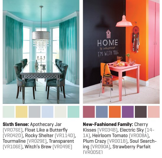
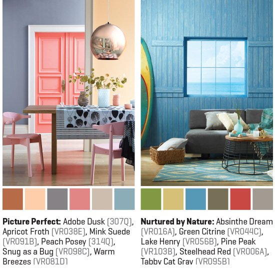
Valspar’s 2015 palette comprises four “dynamic” palettes, each with six colors: Sixth Sense, New-Fashioned Family, Picture Perfect and Nurtured by Nature.
“When selecting colors for the trends,” says Sue Kim, Valspar color expert, “we start by identifying the mood and personality of each color, and then we align it with color-trend stories. We build each palette to go beyond literal translation to express deeper emotional benefits.”
From soothing, almost transparent grays to brighter, bolder hues, Valspar’s trending colors consist of their take on how we live our lives: technology, family, social media, nature.
Kim says, “Each trend has six colors to choose from to apply in any space. You can pick two, three or four colors depending on your space. Some of bold colors are highly popular for kitchen cabinets or other small paint projects.”
Farrow & Ball
The four key colors Farrow & Ball selected for 2015 create a relaxed feel in the home but in different ways, says Charlie Cosby, head of creative at Farrow & Ball.
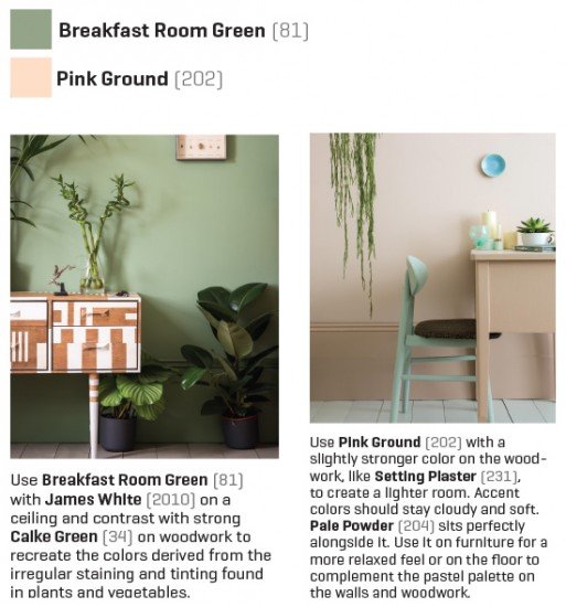
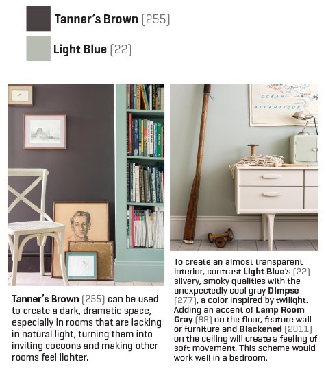
“These colors are all rooted in nature, giving them an inherently soothing feel,” she says. “There is a definite trend toward softer, barely there colors like Pink Ground (202) and Light Blue (22), which are almost translucent in a space. Lush greens like Breakfast Room Green (81) are also very popular, as people increasingly look to bring the outside in. Rich Tanner’s Brown (255) is this year’s take on the dark neutral trend, with a more earthy feel.”
Pantone
Pantone’s spring and fall forecasts include something for everyone. Even if Marsala (18-1438) isn’t quite the hue for your living room, experts suggest trying it out in small doses. The same is true for the entire palette. Choose a neutral like Desert Sage (16-0110) or Glacier Gray (14-4102) for a room, and pair it with accents of deeper shades like Dusk Blue (16-4120) or Tree Top (18-0135). For those shy about introducing brilliant hues, start small. Paint a piece of furniture in Strawberry Ice (16-1720) or Cashmere Rose (16-2215).
Take the advice of Leatrice Eiseman, executive director of the Pantone Color Institute: Keep an open mind about color, and try it in little touches.
“If somebody says to you, ‘Boy, that color would be so great on you,’” Eiseman says, embrace it: Try a nail polish or a throw pillow—something small that the eye can light on to become accustomed to it.
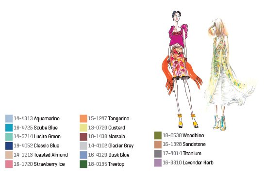
Pantone Fashion Color Report, Spring 2015: En Plein Air
This trending palette is reminiscent of French impressionists painting while surrounded by nature on sparkling summer days. From watery blues and grassy greens to pinks and peaches of springtime blooms, these 16 colors combine brights and pastels. The neutral tans pair well with the blues and purples; Marsala and Sandstone complement one another.
“If you keep an open mind to color, you’ll be more far more adventurous with it,” she says. “And really that’s what color’s all about—having the same fun you had as a child when you were playing with crayons.”
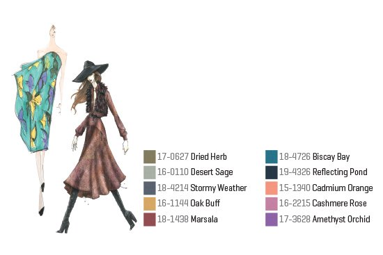
Pantone’s Fashion Color Report, Fall 2015: An Evolving Color Landscape
This palette combines earthy neutrals and bolder brights in 10 colors, including Marsala (18-1438), its Color of the Year. The palette recalls the mixed hues of fall leaves, the autumnal skies and cooler temperatures that call for pulling on a cozy sweater or scarf.
(June 2015)