Sue Kim, Color Strategist, Valspar Paint
What are the biggest trends in fall paint colors?
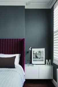
Fall paint color trends feature clean, saturated and bold tones that reflect the positive outlook on life at home. The Electro Noir palette from Valspar’s 2013 Color Trends offers a range of hues with an energizing mood that can carry into both the fall and winter seasons. For example, I recommend pairing warm Valspar Roasted Pumpkin 2005-3A with a dark grey like Valspar Sable Evening 5006-2C to add a modern touch.
If you are looking to change your paint color, don’t be afraid to experiment with bold new colors. Valspar offers the Love Your Color Guarantee, a unique color assurance program, so if you don’t love your first color choice, Valspar will replace it for you.
For more information, visit www.loveyourcolor.com.
What are some suggested accent colors?
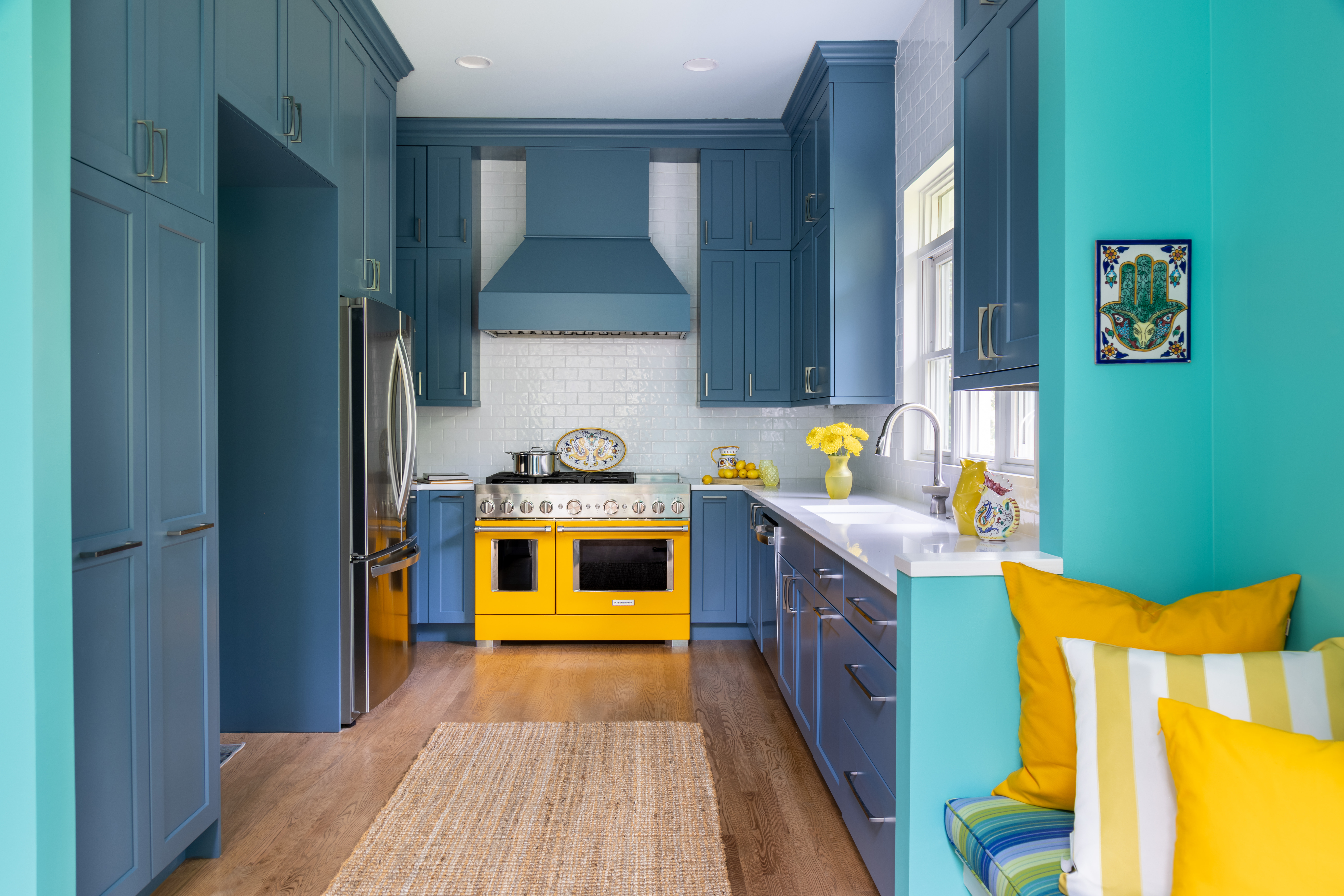
Accent colors are used to create a focal point in a room by adding a vibrant and bright color. When selecting an accent color, I recommend using a darker shade from the same color family already present in the room. If your main wall color is a soft blue like Valspar Tropical Bay 5002-3C, try using a deeper blue with more body like Valspar La Fonda Midnight 4004-4C as an accent color.
What are some ways that people can make their entryways more in tune with the fall season?
Entryways are areas where small changes can make a big impact. For a quick and easy update, try changing the color on the interior side of your front door to add an accent color without painting an entire wall. To embrace the change in season, incorporate lighter tones into your entryway like Valspar Filtered Shade 4003-1B or Valspar Brown Buzz 6005-3B to help lift the mood in the space as we head into the colder months.
What are some tips for simple upgrades that can be done without a complete overhaul?
Painting a ceiling is a great way to open up a room without doing a complete overhaul. If you have higher ceilings, try a color like Valspar Bluer Than Blue 4006-8C, a crisp shade of blue that will enhance the mood of the room without being heavy.
Another simple upgrade is to paint small pieces of furniture. Use bright colors like Valspar Iris Moon 4004-9C and Valspar Mustard Glaze 3006-3A on chairs or side tables to add pops of color. These smaller pieces allow for some change without being too overpowering.
Sarah Cole, Farrow & Ball Marketing Director
What are the biggest trends in fall paint colors?
We’re seeing a definite trend for greys and the use of darker colours on walls as the ‘new neutral’. Soft greys are being used to create a tonal look, pair Cornforth White, a light grey, with Strong White and All White. The use of subtly different whites, off-whites and greys will create really flexible spaces in the home, with light and flow throughout. This simple idea of laying one tone upon another is easy to achieve, and creates a hushed, soothing environment illuminating the space. Darker shades like Black Blue, Down Pipe and Hague Blue are increasingly being used on the walls as the new neutral to create dramatic, moody spaces. These intense colours make the brighter shades we’re seeing in fabrics and accessories really pop.
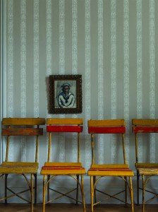
What are some suggested accent colors?
When using dark colours on the walls, Farrow & Ball recommends layering shades of black—use Black Blue on the walls and Pitch Black on the woodwork, accent with greys and brights. Strong colours like Babouche, Arsenic and Charlotte’s Locks are all popular accent colours this fall. Try painting furniture in one of these colours to quickly update a space.
What is the trend in wallpaper?
Animal prints and geometric designs are certainly popular trends in wallpaper. Our newest wallpapers embrace both themes. Ocelot and Rajah Stripe are inspired by animal skins, while our Lattice and Tessella patterns are both geometrics. Although more contemporary designs, these new papers are made in just the same way as all Farrow & Ball papers—using traditional methods and real paints to provide a textured appearance and timeless quality.
What are some ways that people can make their entryways more in tune with the fall season?
No matter the season, entryways and bathrooms are great spaces for stronger, brighter colours like Charlotte’s Locks or Drawing Room Blue. You pass through entryways, so the use of strong colour does not jar. These tones also work well in bathrooms as these are often smaller spaces which are brought to life with the use of a cheery shade.
What are some tips for simple upgrades that can be done without a complete overhaul?
The floor is increasingly seen as the “fifth wall,” a space to display artwork and do something different. Farrow & Ball’s Floor Paint is a simple way to transform wood or concrete floors with colour. Paint a stair runner, rug or stripes to create bespoke, eye-catching designs, or revive a space by simply painting the floor in a single colour. – Jennifer Shapira


